(under construction)
 |
| Time sequenced lattice chart of 417,834 Windows Security log entries. |
This cruft is similar to my post Avoiding XPath : Part II. However, here I am (laboriously) converting EVTX to CSV with Powershell 3.0. The files are sizeable, taking about an hour to convert to CSV. The charts take a non-negligible amount of time to load on my i5 4GB laptop.
# Powershell Archive Security listing
a--- 2/5/2012 3:18 PM 614993920 Archive-Security-2012-02-05-23-16-29-596.evtx
a--- 2/10/2014 8:13 PM 422948414 Archive-Security-2012-02-05-23-16-29-596.evtx.csv
a--- 2/7/2012 1:37 PM 614993920 Archive-Security-2012-02-07-21-35-54-163.evtx
a--- 2/10/2014 9:04 PM 411968863 Archive-Security-2012-02-07-21-35-54-163.evtx.csv
a--- 2/13/2012 9:25 AM 614993920 Archive-Security-2012-02-13-17-24-39-674.evtx
a--- 2/10/2014 10:03 PM 425452871 Archive-Security-2012-02-13-17-24-39-674.evtx.csv
a--- 2/13/2012 6:41 PM 614993920 Archive-Security-2012-02-14-02-40-08-681.evtx
a--- 2/10/2014 10:11 PM 33347712 Archive-Security-2012-02-14-02-40-08-681.evtx.csv
I create an array of files (as below) and use a function to mass convert them:
[array]$filelist =
" Archive-Security-2012-02-05-23-16-29-596.evtx",
"Archive-Security-2012-02-07-21-35-54-163.evtx",
"Archive-Security-2012-02-13-17-24-39-674.evtx"
Function Convert-Logs3 {
[cmdletbinding()]
Param(
$filelist=$NULL
)
$filelist | foreach-object {
Get-WinEvent -Path "$PSItem"| Select RecordID,ID,TimeCreated, Message | export-csv -notypeinformation -path $(write "$PSItem.csv");
[System.gc]::collect();
}
}
I load one of the converted CSV files into R, parse the Message field and produce charts (far below). One of the newer laptops with fourth gen i7 and 16GB of DDR3 RAM would be useful. First I load the file and strip the Message file of tabs and returns.
# R
read.csv("Archive-Security-2012-02-05-23-16-29-596.evtx.csv", as.is=TRUE)
d <- read.csv("Archive-Security-2012-02-05-23-16-29-596.evtx.csv", as.is=TRUE)
h <- gsub('\n\t',' ',d$Message,fixed=TRUE)
h <- gsub('\n\n',' ',h,fixed=TRUE)
h <- gsub('\t\t',' ',h,fixed=TRUE)
h <- gsub('\n',' ',h,fixed=TRUE)
h <- gsub('\t',' ',h,fixed=TRUE)
h <- gsub('%%','',h,fixed=TRUE)
d$Message <- h
The result is below. Click to enlarge. I won't be parsing the Message field anymore in this post.

The R packages below are needed. Note the field names are different in an EVTX than in a live event log (RecordID, ID, Time Generated):
library(plyr) # 'count'
library(data.table) # 'data.table'
library(lattice) # 'barchart'
library(ggplot2)# 'arrange'
DF <- d
DT <- data.table(DF)
setkey(DT,RecordId)
DF_count <- data.frame(count(DT$Id))
arrange(DF_count,freq)
DF_arrange <- (arrange(DF_count,freq))
barplot(DF_arrange$freq,names.arg=(DF_arrange$x),xlab="Event IDs", ylab="Event IDs Count" )
barchart(~as.numeric(DF_arrange$freq) | as.factor(DF_arrange$x),xlab="Event Index")
dotplot(~as.numeric(DF$RecordId) | as.factor(DF$Id), xlab="Event Index")
DF4624 <- data.frame(DT[Id=="4624"])
DF4688 <- data.frame(DT[Id=="4688"])
DF5154 <- data.frame(DT[Id=="5154"])
DF5157 <- data.frame(DT[Id=="5157"])
DF4624_4688 <- merge.data.frame(DF4624,DF4688,all=TRUE)
DF5154_5157 <- merge.data.frame(DF5154,DF5157,all=TRUE)
DF4624_4688_5154_5157 <- merge.data.frame(DF4624_4688,DF5154_5157,all=TRUE)
DF_TG <- DF4624_4688_5154_5157
dotplot(~as.numeric(DF_TG$RecordId) | as.factor(DF_TG$Id), xlab="Event Index")
nrow(DF_TG)
DF_TG <- data.frame(DF_TG[16500:24500,1:3])
dotplot(~as.numeric(DF_TG$RecordId) | as.factor(DF_TG$Id), xlab="Events (Time)")
Here's the run:
> DF <- d
> DT <- data.table(DF)
> setkey(DT,RecordId)
>
> DF_count <- data.frame(count(DT$Id))
> arrange(DF_count,freq)
x freq
1 1100 1
2 1104 1
3 1105 1
4 4698 1
5 4699 1
6 4724 1
7 4738 1
8 4779 1
9 8222 1
10 4702 2
11 4904 2
12 4905 2
13 5140 2
14 5143 2
15 521 3
16 4647 3
17 4608 4
18 4610 4
19 4614 4
20 4902 4
21 4944 4
22 5024 4
23 5033 4
24 5056 4
25 5449 4
26 5450 4
27 1101 5
28 5142 5
29 4663 7
30 4625 8
31 4800 10
32 4801 10
33 5448 12
34 5031 13
35 4690 14
36 5145 14
37 4648 16
38 4674 18
39 4634 20
40 4950 20
41 5444 20
42 4776 24
43 5442 24
44 4622 36
45 4956 37
46 4719 91
47 4672 97
48 4611 102
49 4624 120
50 5446 120
51 4985 136
52 5441 156
53 4945 408
54 4673 491
55 4957 3118
56 5154 6328
57 4658 13790
58 4689 14110
59 4688 14485
60 5157 18149
61 4656 32222
62 5158 42381
63 5152 49172
64 5156 58538
65 5447 163442
>
> DF_arrange <- (arrange(DF_count,freq))
> barplot(DF_arrange$freq,names.arg=(DF_arrange$x),xlab="Event IDs", ylab="Event IDs Count" )
> barchart(~as.numeric(DF_arrange$freq) | as.factor(DF_arrange$x),xlab="Event Index")
> dotplot(~as.numeric(DF$RecordId) | as.factor(DF$Id), xlab="Event Index")
>
> DF4624 <- data.frame(DT[Id=="4624"])
> DF4688 <- data.frame(DT[Id=="4688"])
> DF5154 <- data.frame(DT[Id=="5154"])
> DF5157 <- data.frame(DT[Id=="5157"])
>
> DF4624_4688 <- merge.data.frame(DF4624,DF4688,all=TRUE)
> DF5154_5157 <- merge.data.frame(DF5154,DF5157,all=TRUE)
> DF4624_4688_5154_5157 <- merge.data.frame(DF4624_4688,DF5154_5157,all=TRUE)
> DF_TG <- DF4624_4688_5154_5157
> dotplot(~as.numeric(DF_TG$RecordId) | as.factor(DF_TG$Id), xlab="Event Index")
>
> nrow(DF_TG)
[1] 39082
> DF_TG <- data.frame(DF_TG[16500:24500,1:3])
> dotplot(~as.numeric(DF_TG$RecordId) | as.factor(DF_TG$Id), xlab="Events (Time)")
 |
| A general barplot is is not so useful for 417K events. |
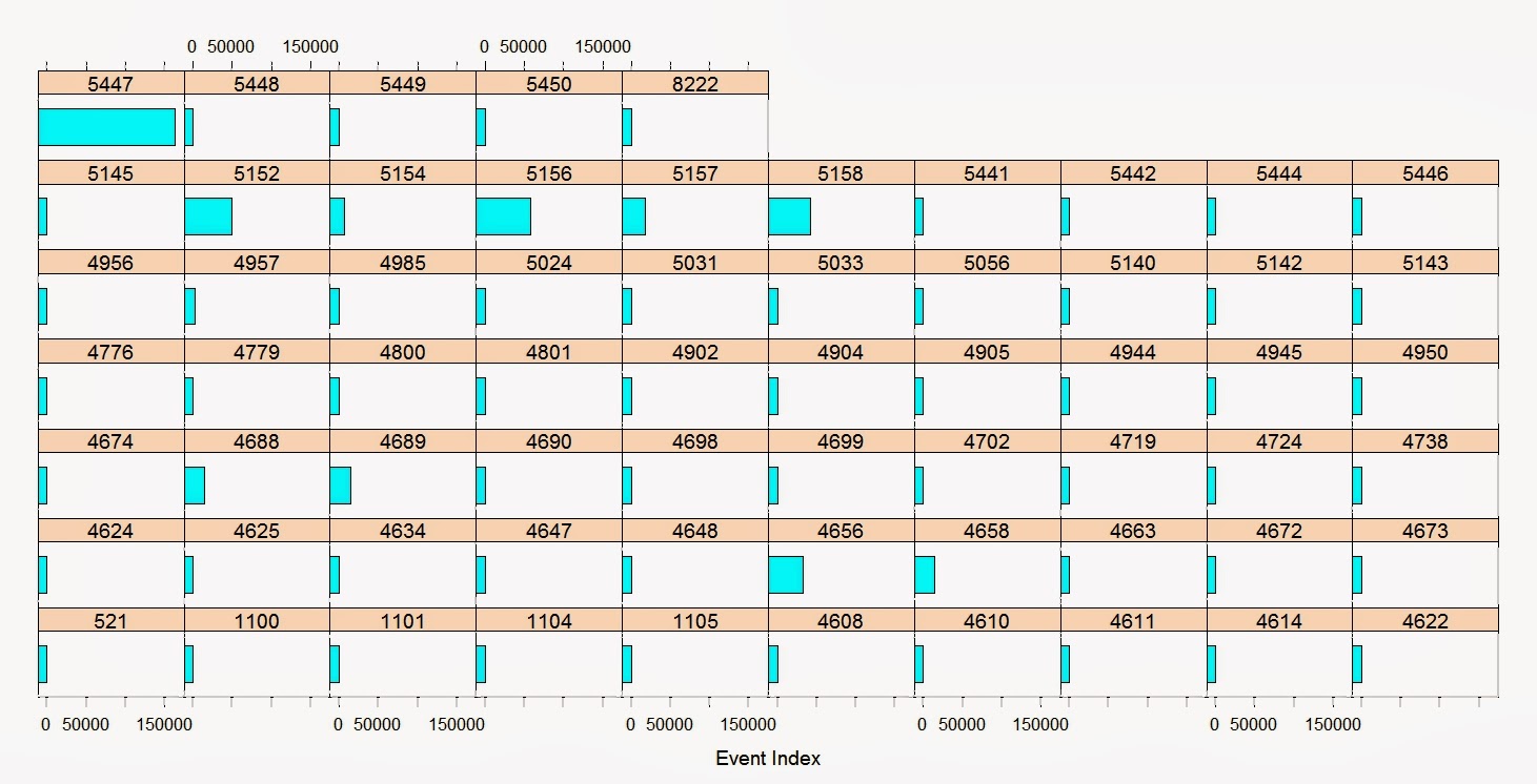 |
| So a barchart (lattice) gives us a better idea of amounts. |
|
| But a dotplot (lattice) can give us Events in proportion through time. |
 |
| We can filter specific events and then zoom in on the timeline. |
No comments:
Post a Comment